PROJECT OVERVIEW
Taskworld is a workplace management tool that helps empowers businesses to streamline operations, enabling better communication and collaboration.
Problem
Despite its benefits, some users have expressed dissatisfaction with the existing mobile application and have consistently provided feedback to CX team for improvement.
My Role
I joined this project as a part of product design team in it’s early stages to redesign the entire mobile experience where I conducted continuous product discovery and collaborated with team to provide end to end product design handoffs with mobile design system.
Outcome
60%
Users found new gestures useful for instant tasks and productivity.
Maze Report
85%
Users found redesigned app intuitive and effortless to navigate.
Maze Report
80%
Users reported a more satisfying learning experience overall.
Maze Report
Tools Used

Figma

Miro
Maze

Intercom

Mixpanel
Disclaimer: The data in this case study is simulated and created solely to demonstrate my design process. I strictly adhere to confidentiality agreements, ensuring no proprietary or sensitive information is disclosed.
HIGHLIGHTS
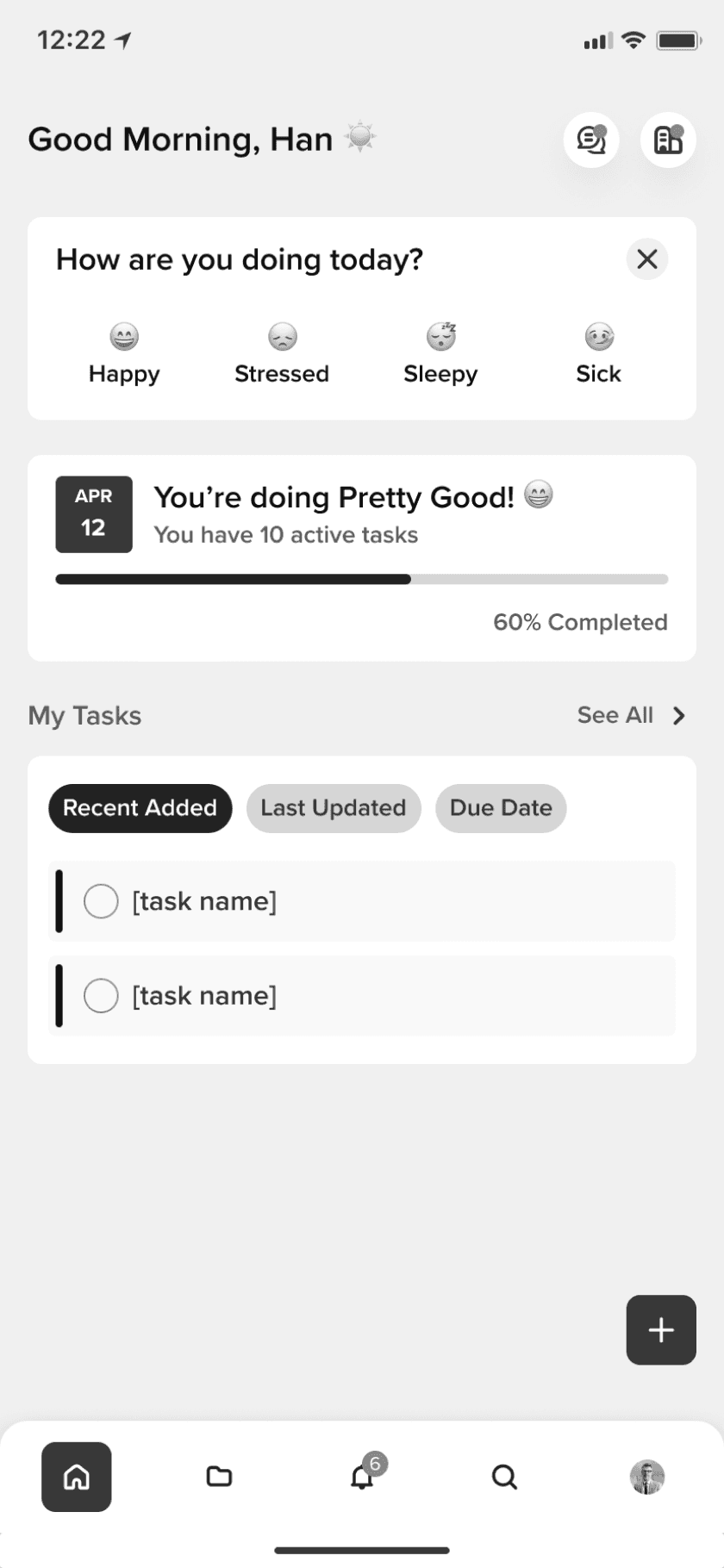
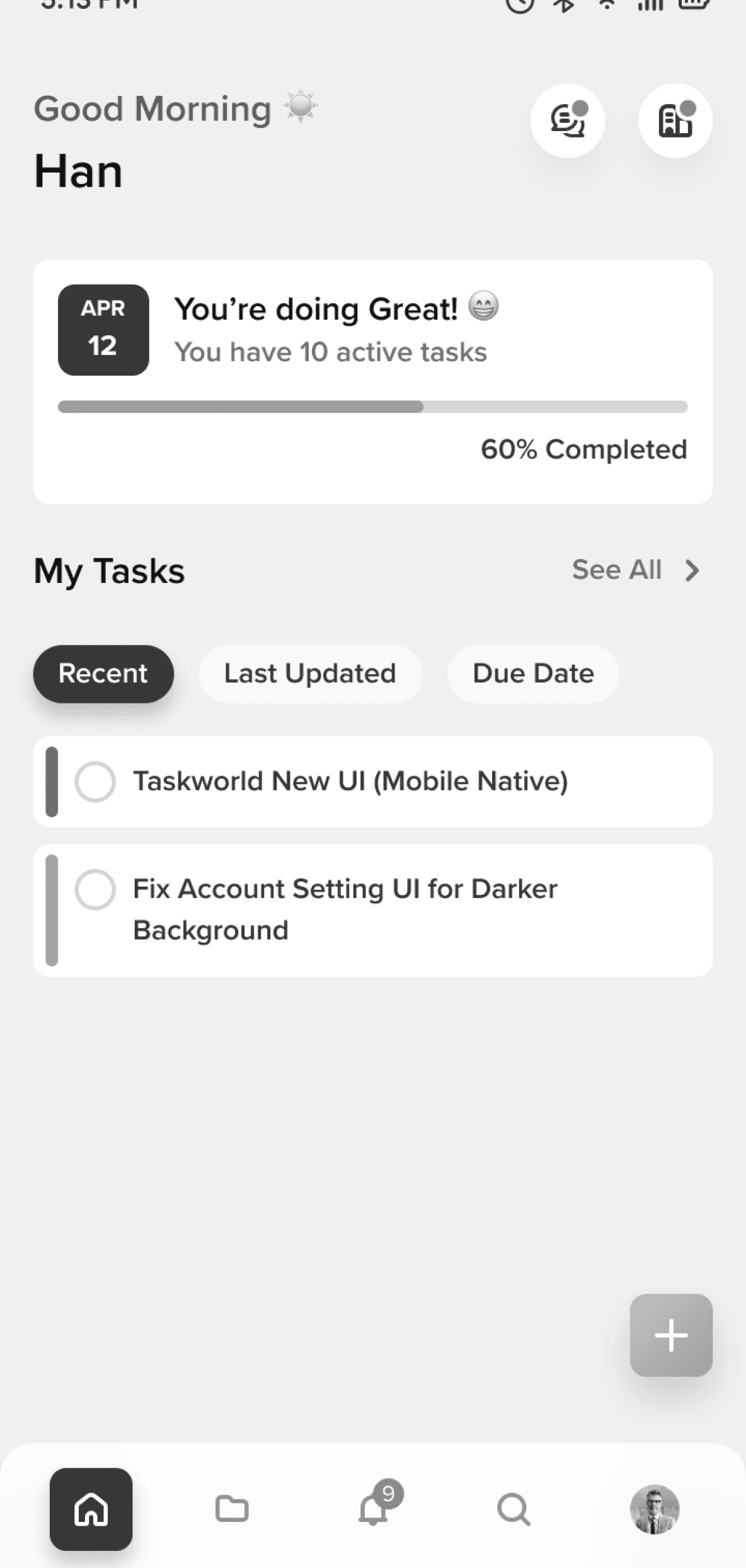
Designed for Peak Productivity
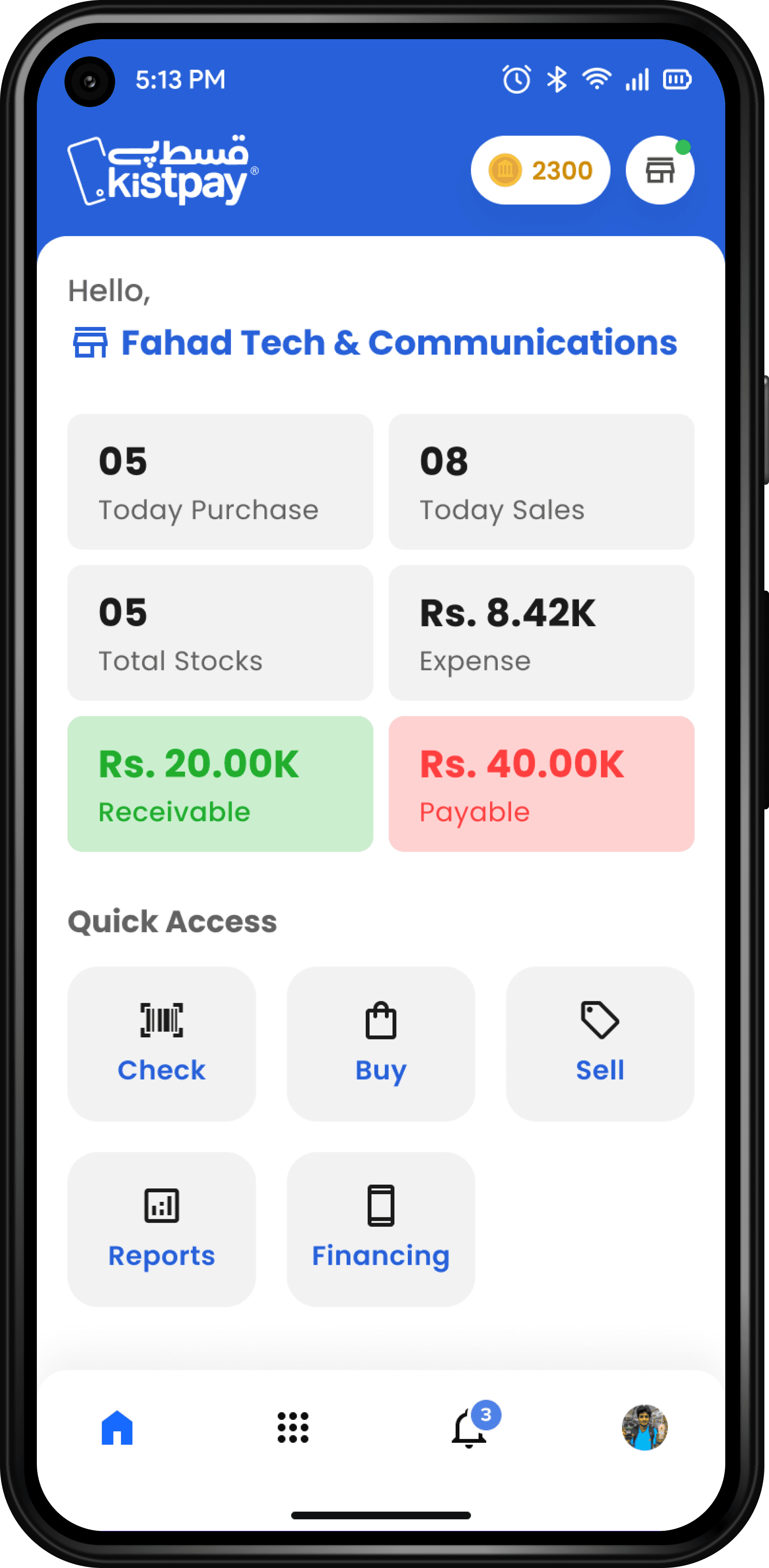
EASY NAVIGATION
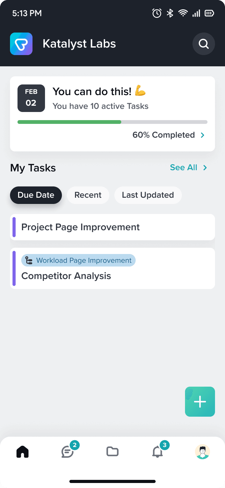
We designed dashboard with minimal interaction and easy to navigate
QUICKER GOALS
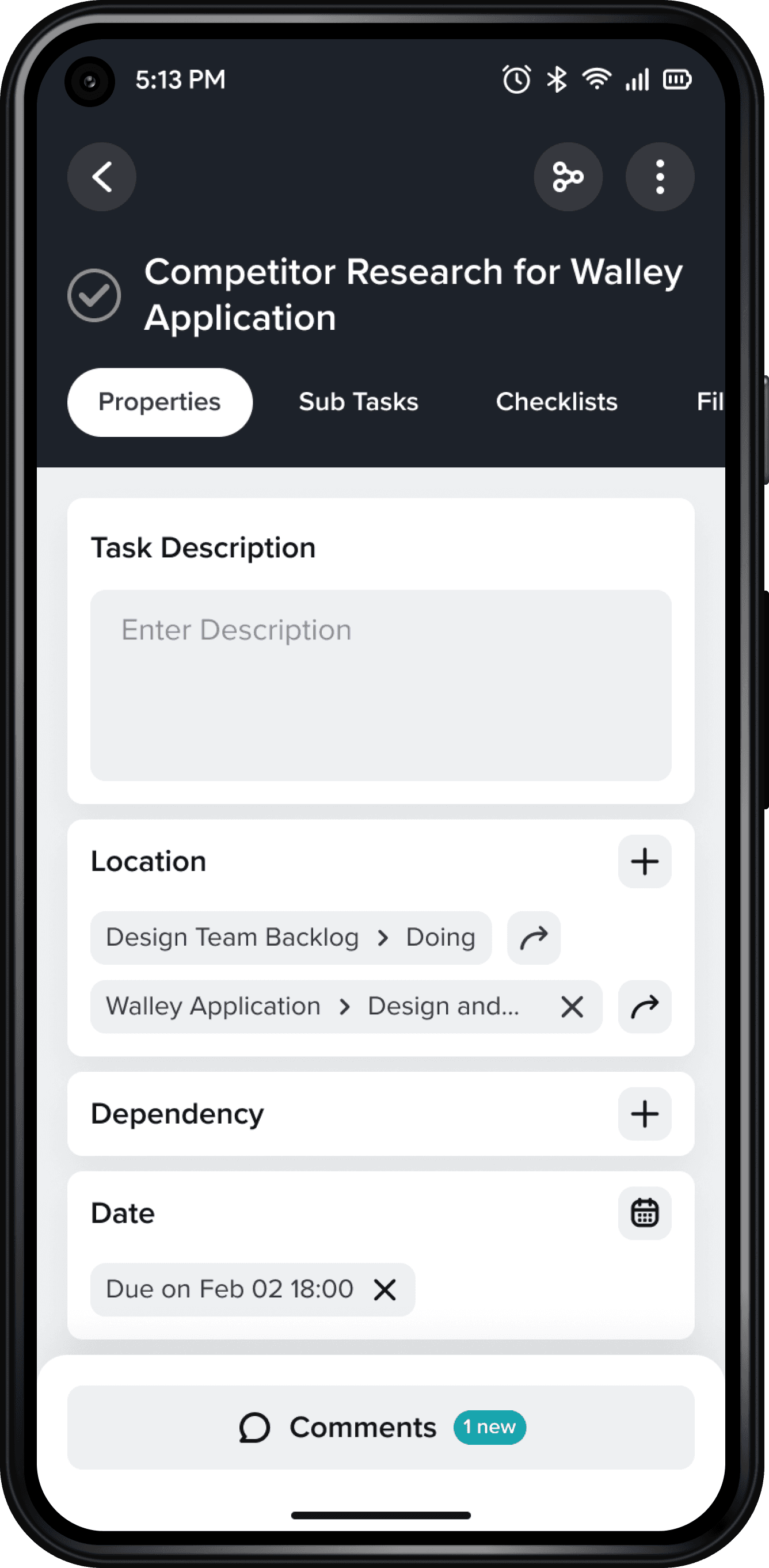
Now Task screen has everything you need. Create, Update, Comment and Complete.
STAY UPDATED
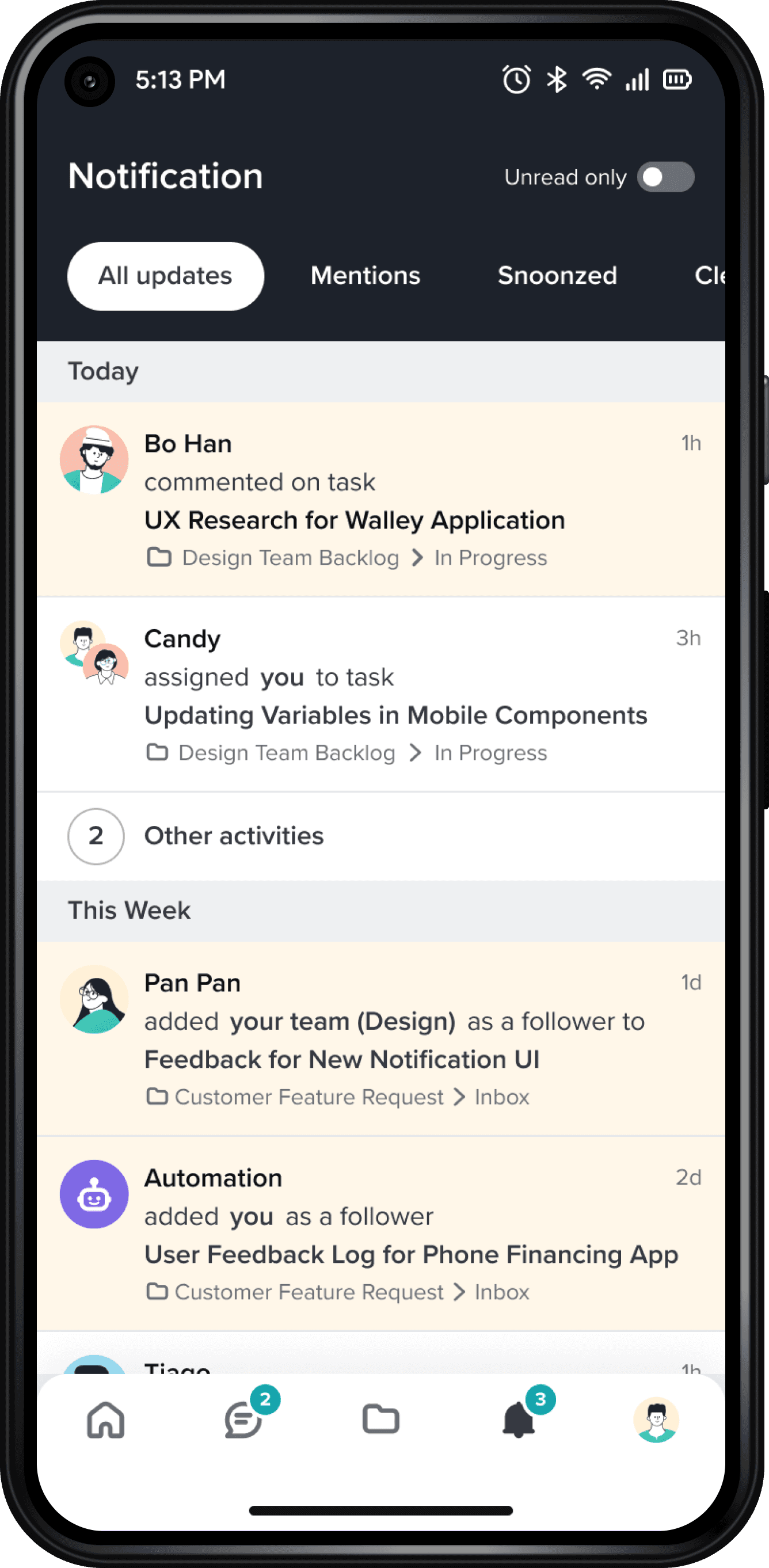
Most of our customer do use notification so we designed the optimized notification screen.
KICK-OFF MEETING
Setting up Goals
Before jumping into creating process and discovery, we hold a meeting with stakeholders to defined Goals for this project in terms of delivering value to both Customer and ourselves as a Business.
Customer Goals
Identify customer needs that are currently affecting 35% of our existing mobile users
Introduce new skin for mobile app with a lot of enhancement in accessibility
Business Goals
Increase Customer Engagement and Retention using mobile app by 40%
Repositioning Taskworld to acquire more paid customers by 15% through mobile app
Design Process
We developed a non-linear process within the LeSS (Large Scale Scrum) Framework for continuous product discovery and development, where we often revisited the root problem or brainstormed new solutions after testing ideas.
Me
Head of Design
Product Manger
Head of Engineers
Product Engineers
DISCOVERING ISSUES
Exploring Current Usage
We started by deep diving into existing mobile usage through Mixpanel to identify the most common app features.
56%
Seeing Notification
45%
Replying to Chat on Channel
42%
Commenting on Task
32%
Add Task on Project
31%
Task: Properties Tab
25%
Starting Time Tracking
17%
Switching to Workspace
13%
Add Due Date on Task
10%
Create Button - Task
9%
Add Location to Task
7%
Move Task on Project
3%
in-task-properties-add-description
2%
in-task-file-tab
1%
in-project-add-tasklist
User Flow Analysis
Mapping Mixpanel's flows with our existing Information Architecture helped us to calculate the user drop-off rate for each event.
We took screen and mapped the top used events on Miro that I found on Mixpanel

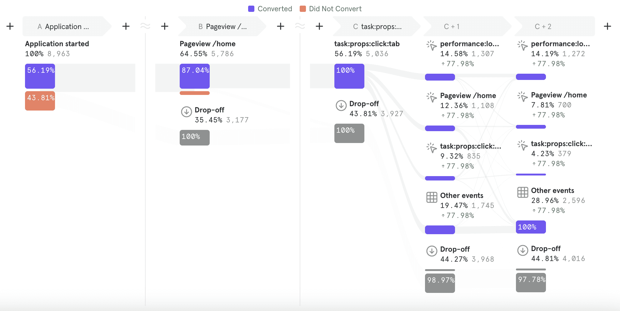
We examined top used events more on Mixpanel to find where user are dropping off
With all these analysis and reports, We found that:
65%
of features in mobile app were hidden and unused with zero usage
44%
customers were dropping off overall after navigating to different screens
32%
customers stucked in an infinite loop when they wanted to go back
Customer Surveys
To further investigate these issues, we wanted to gather more qualitative data from our customer. We worked with our customer success team to design a survey through Intercom and selected 50 workspaces to sent out.

96
Participants
50
Workspaces
06
Questions
Results
Within one week, we got over 96 results out of 50 workspace we potentially selected for. We found that:
They dropped off due to:
Difficult to Navigate
49%
Bad User Interface
32%
Bad Performance
19%
They use mobile app to:
Check their tasks
Comment on tasks
Chat
Check notification
View project
44%
Users aims to have quicker & shorter goals
72%
User uses mobile app when working outside
REFRAME THE PROBLEM
Design Opportunities
The above findings helped us further narrow down problems facing on mobile app, so we identified few design opportunities here:
We know that our mobile app has alot of unused features.
How might we design an app with few most common features, that would increase the performance by 40%?
We know our customer wants shorter goals in the app.
How might we design an app with simple yet easy to navigate, that would increase the engagement by 20%?
Creating Stories
Through multiple iterations and revisiting the problem, we formulated additional design questions. I worked closely with product manager to identify, create and refine user stories based on customer needs
While we were creating stories, we used RICE framework to prioritize features according to our customer needs.

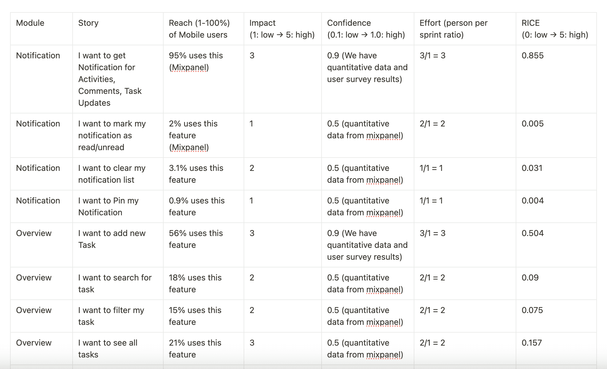
Note: All data are edited due to confidentiality
IDEATE AND PROTOTYPE
Brainstorming Ideas and Testing them
We conducted brainstorming workshop with other designers and engineers during refinement sessions to Ideate and Validate on different design questions.
For Instance,
How might we minimise the interaction on dashboard?

And we tested using Maze
We found some insights while testing ideas with internal team:
The average time for completing frequent goals reduced to 1 minute after redesign
The task we designed for testing were straight forward and clear
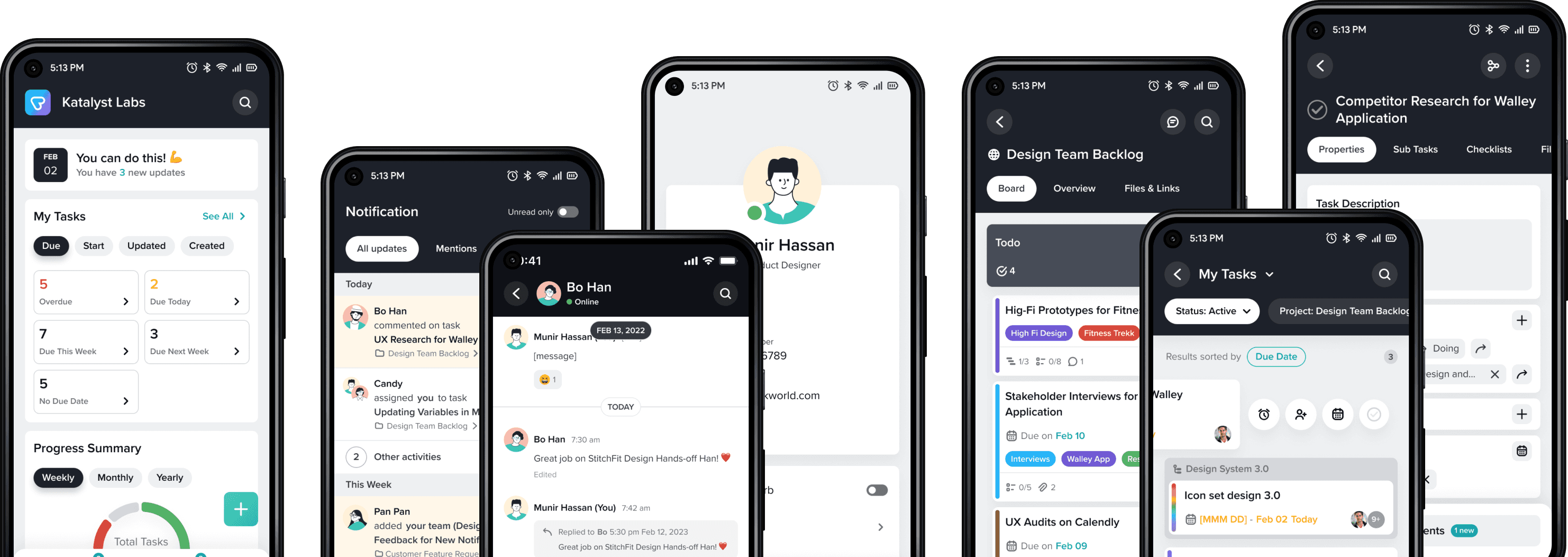
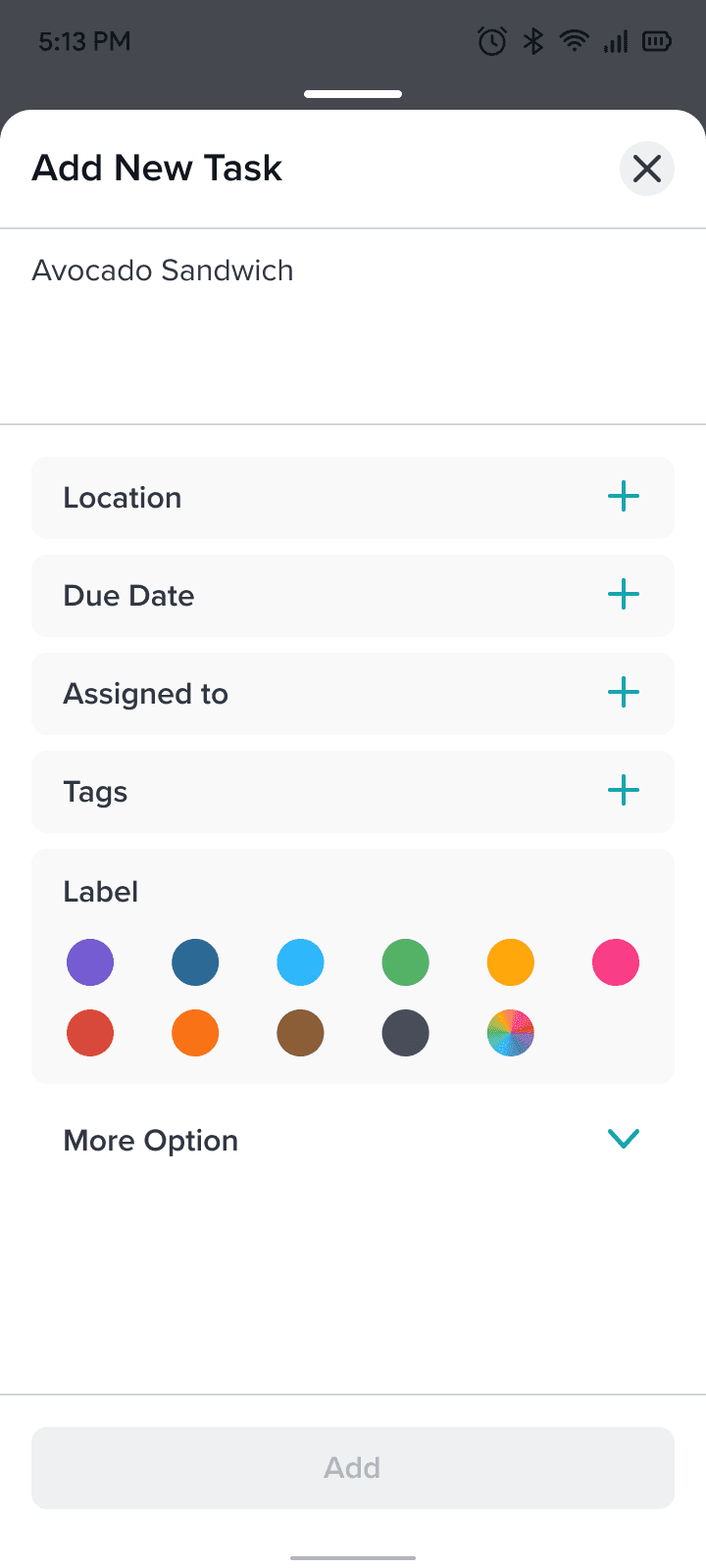
Creating High-Fidelity Prototypes
We started working on High fidelity prototypes by structuring Design System for the user interface and determining major screens of the app.
While structuring components, we used Figma variables to optimize the design before handing it over to the developer.
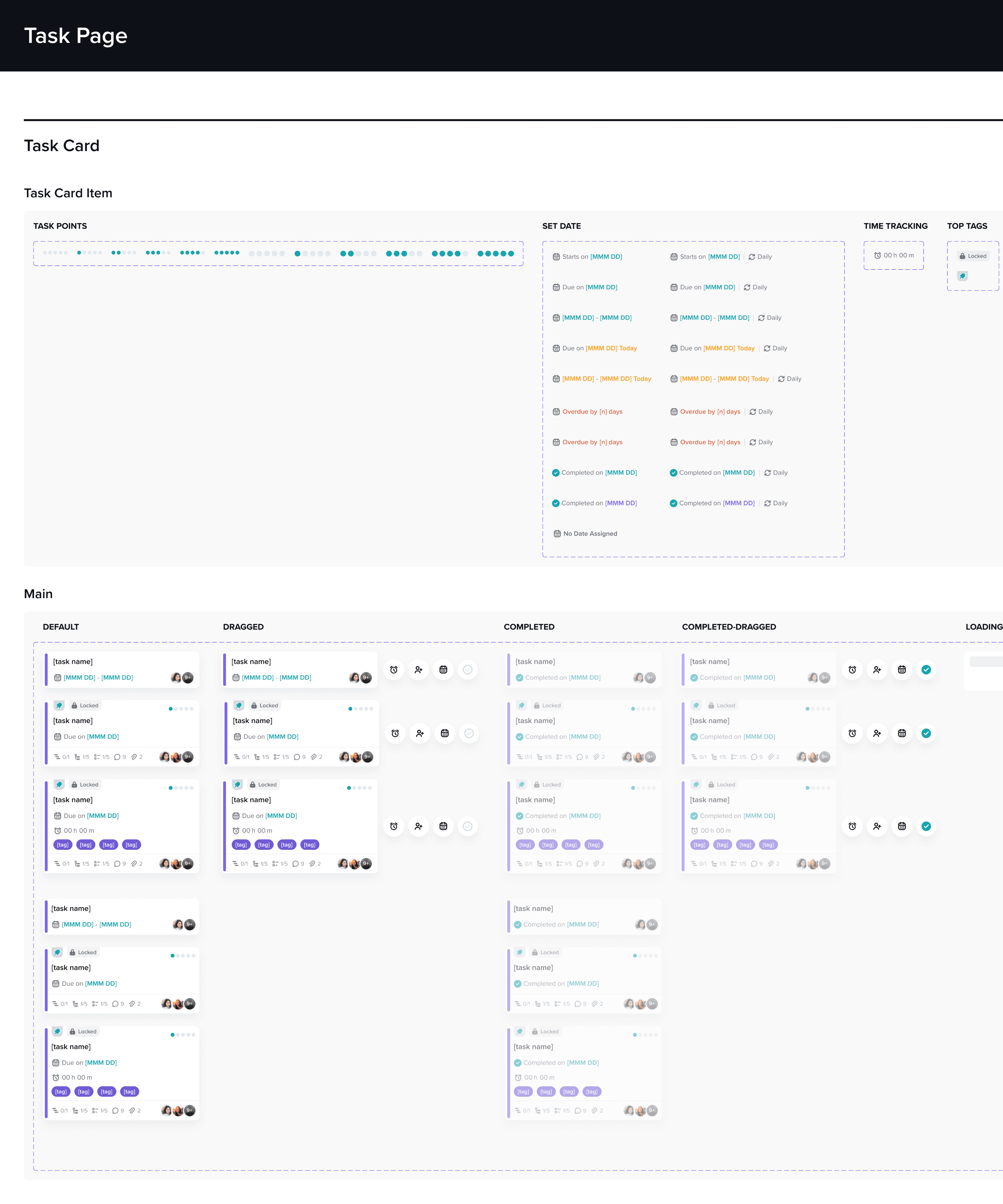
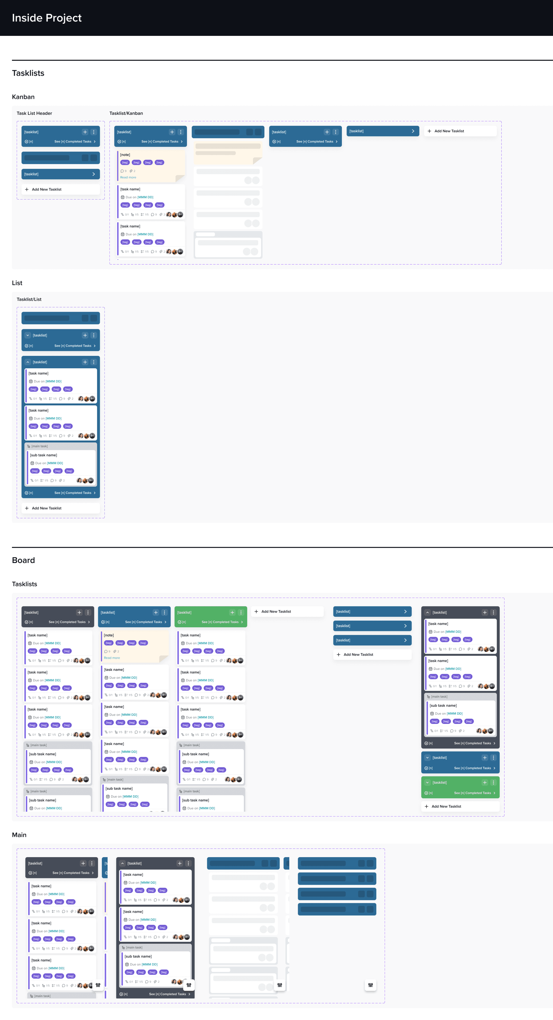
we designed over 100 of scenarios with each module with clickable prototype that we were using for usability testing.

TEST AND ITERATE
Usability Testing
We select few but most frequent scenarios for Usability Testing that we were conducting over Maze
Testing Session
We invited both internal and external participants to complete various tasks. We asked follow up questions to get feedback
15
Participants
05
Tasks
56%
Average Success Rate
Completing Task


Over a week, we got numerous feedbacks from participants which we used to iterate our design further.

None because It seems easy to use thanks

At first, I thought this is a not swippable card

It is easy to use but at first it required me a moment to understand how to complete task from dashboard

When set date it would be better if default date section to be selected with "start date" not " due date" as I have to click again to "start date" to set start date. Thanks

On the second screen I was not able to adjust the time. The rest of the experience was intuitive.

All good. The only thing that was confusing because I think I either know it differently from desktop or I just rarely set start dates that after adding a start date the date screen remained open for the due date. Same like booking a hotel or a flight. I think a little visual feedback that start date was set successful would help so I know I can go ahead and set due date right away.
Gathering Feedback and Improving
We gathered and synthesized feedback and recommendations from participants we got from usability testing. We grouped them into themes and reddesign the solution accordingly
Feedback
Dashboard should have my stats rather than recent tasks
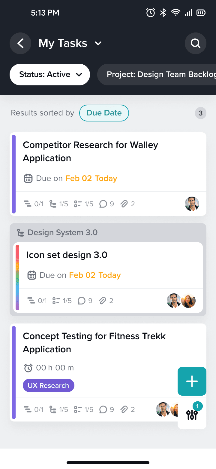
Redesign
We redesigned dashboard with simple task overview and stats

Feedback
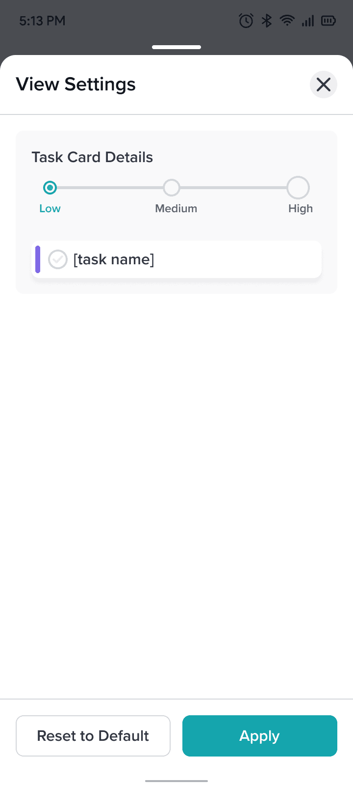
There are too much task details on card in overview screen.
Redesign
We designed solution to change the details on task cards
CONCLUSION
Major Takeaways
Challenges
During the project, I faced several challenges, including conducting UX research within the LeSS Scrum framework to meet agile delivery deadlines, efficiently integrating Figma variables into our existing design system, and assisting the product manager in prioritizing tasks using the RICE framework. Despite these hurdles, I took full responsibility from the discovery to delivery phases, facilitating ideation and testing sessions, ensuring timely completion of deliverables, and ultimately enhancing my skills and learning.
Learnings
As a product designer, collaborating closely with the Product Manager to prioritize the user backlog, I learned valuable skills in conducting UX research within the LeSS Scrum framework. I gained experience in efficiently integrating Figma variables into our design system and utilized external tools like Mixpanel for data analysis. These tools enabled me to gather real user data and transform it into meaningful insights, which I leveraged to design new opportunities for improvement.
Future Work
As the scope of this project is ongoing, we are continuously explored new opportunities for improvement in mobile app that can provide value to our customers. We gathered feedback and continued to iterate on product cycle to ensure that it meets the evolving needs of our users.
COLLABORATORS